

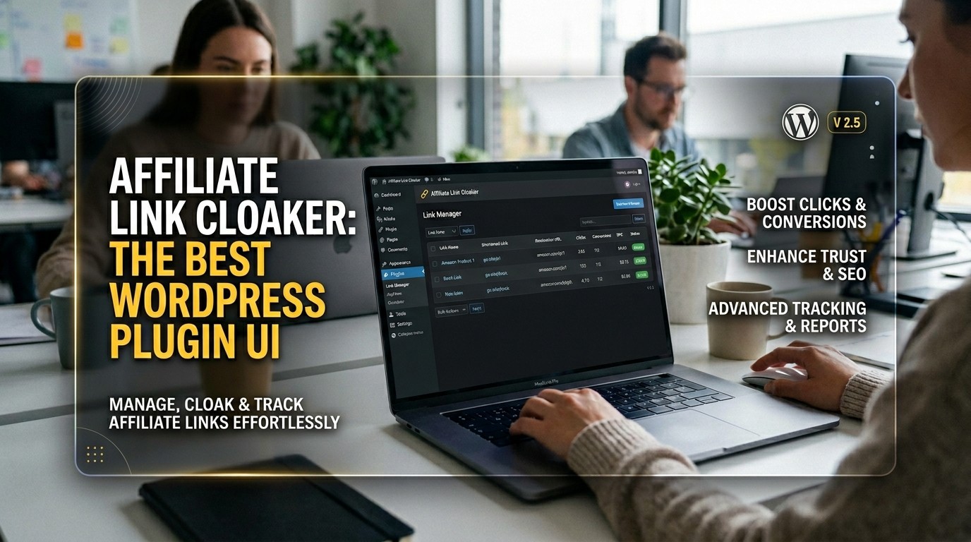
This guide explains how a cleaner WordPress interface supports trust, usability, and faster affiliate publishing while helping site owners manage links with confidence and less friction.
the plugin is more than a utility for shortening or disguising long URLs. It shapes the first impression a visitor gets when a page recommends a product or references an external offer. When a link looks organized and intentional, readers feel more comfortable interacting with it. That comfort matters because trust is fragile online.
For site owners, Affiliate Link Cloaker is also a workflow decision. A good interface saves time, reduces confusion, and keeps publishing tasks from feeling heavy. The right design lets a creator focus on the article itself instead of wrestling with the plugin. That is why interface quality can be the difference between a tool that gets used and one that gets ignored.
What Users Expect From a Good Plugin
When people install Affiliate Link Cloaker, they usually want three things at once: clarity, speed, and control. They want to know where the main actions are, they want link creation to be fast, and they want enough control to avoid mistakes. A plugin that supports all three creates a noticeably better experience.
Affiliate Link Cloaker should make the next step obvious. If the user is creating a new cloaked URL, the form should feel straightforward. If the user is updating a destination, the edit path should be equally clear. If the user is checking performance or organization, the dashboard should present that information without clutter.
Human Psychology and Link Trust
Readers do not analyze every design detail, but they do respond to patterns. A clean link structure creates a subtle sense of order, and order tends to feel trustworthy. Affiliate Link Cloaker can support that feeling by helping publishers present links in a way that looks deliberate rather than random.
The psychology is simple. People hesitate when something looks messy or unclear. They move faster when the presentation feels stable. Affiliate Link Cloaker benefits from that reality because its job is not just to hide a long URL; it is to make the link experience feel safer and easier to understand.
Dashboard Design That Reduces Friction

A strong dashboard should reduce the number of decisions a user has to make. Affiliate Link Cloaker works best when the homepage of the plugin answers the most common questions immediately. Which links are active? Which ones need editing? Which ones belong to a specific category? Can the user find a recent link without scanning every entry?
Good design cuts friction by showing only what matters. Affiliate Link Cloaker should use spacing, labels, and button placement to prevent overload. The more quickly someone understands the layout, the more likely they are to keep using the tool over time.
Core Features That Improve Everyday Use
The best version of Affiliate Link Cloaker usually includes search, categories, status labels, quick edits, and visible confirmation messages. These features may sound basic, but they remove repeated pain points. Search helps users find older links. Categories help organize campaigns. Status labels reveal whether a redirect is live, draft, or inactive.
Affiliate Link Cloaker becomes more useful when the interface reflects real daily work. People do not manage only one or two URLs. They manage campaigns, posts, updates, and content refreshes. A plugin that supports that reality earns long-term loyalty.
Table of Practical UI Priorities
| UI Priority | Why It Helps |
|---|---|
| Clean layout | Makes navigation easier |
| Quick editing | Saves time |
| Search tools | Improves link retrieval |
| Status indicators | Prevents errors |
| Category filters | Improves organization |
| Mobile support | Helps flexible work |
Affiliate Link Cloaker should align with these priorities because the best interface is one that turns routine tasks into quick habits. When the tool feels smooth, the user keeps moving.
Building a Professional Content Workflow
A professional publishing workflow depends on repeatability. Affiliate Link Cloaker should help creators create a link once, organize it correctly, and reuse it without confusion. This matters most when content teams manage many articles at the same time.
The right workflow also reduces mental fatigue. If every task is obvious, the user does not need to relearn the tool every session. Affiliate Link Cloaker can support that kind of stability through predictable navigation and consistent button behavior.
Why Simplicity Often Wins
Many tools try to impress users with complex menus and crowded settings. In practice, that often creates hesitation. Affiliate Link Cloaker is stronger when it stays simple, focused, and easy to scan. Simplicity does not mean weak functionality. It means the important functions are easy to reach.
A simple interface helps both beginners and experienced users. Beginners need reassurance. Experienced users need speed. Affiliate Link Cloaker succeeds when it delivers both without turning the screen into a puzzle.
Link Presentation and Brand Perception
A cloaked link is also a branding signal. Affiliate Link Cloaker can make a site feel cleaner, more intentional, and more polished. A neat URL structure suggests that the publisher cares about presentation and consistency, which can positively affect how readers judge the page.
Brand perception matters because affiliate content can already feel promotional. Affiliate Link Cloaker helps reduce the feeling of clutter. That makes the recommendation feel more curated and less intrusive, which supports a better overall reading experience.
Scaling as the Site Grows
A blog may start with a handful of links, but growth changes the workload. Affiliate Link Cloaker should remain usable whether the site has ten links or a few hundred. That is where scalable UI design becomes important. Search, bulk actions, and filters matter much more when the library expands.
Affiliate Link Cloaker should not feel harder to use as the content library becomes more valuable. The interface should protect the creator from chaos as volume increases, not add to it.
Trust, Risk, and Mistake Prevention
Errors in affiliate management can be expensive. A broken redirect, a duplicated slug, or a wrong destination can interrupt user flow and reduce trust. Affiliate Link Cloaker should lower that risk through confirmations, validation, and clear warnings.
Mistake prevention is part of good design because it supports confidence. If the user knows the plugin will flag problems, they can move faster without fear of silent failure. Affiliate Link Cloaker therefore becomes not just a convenience tool but a safety layer.
Reader Experience Beyond the Dashboard
Even though readers never see the backend, they feel its influence. Affiliate Link Cloaker helps shape the visible part of the journey by making links cleaner and easier to understand. That influences whether a user continues reading, clicks confidently, or bounces away.
The reading experience improves when the content feels organized. Affiliate Link Cloaker contributes to that by helping publishers place links thoughtfully rather than carelessly. Small signals often create large effects over time.
A Table of Common User Goals
| User Goal | Helpful Plugin Behavior |
|---|---|
| Save time | Fast edits and bulk actions |
| Stay organized | Categories and search |
| Avoid mistakes | Warnings and previews |
| Improve trust | Clean branded links |
| Scale work | Efficient link management |
Affiliate Link Cloaker should map cleanly to these goals. When the plugin lines up with real needs, it becomes easier to adopt and harder to replace.
Why Affiliate Teams Care About Speed
Teams working on affiliate sites often manage publishing deadlines, seasonal campaigns, and content refreshes. Affiliate Link Cloaker supports speed by making the link side of the workflow easier to repeat. That matters because every unnecessary click adds drag to the process.
Speed is not only about finishing faster. It is about freeing attention for better work. When Affiliate Link Cloaker handles the repetitive details, creators can spend more time improving headlines, callouts, and placement strategy.
The Psychology of Comfort
Comfort is a surprisingly important software metric. People return to tools that feel comfortable because comfortable tools reduce resistance. Affiliate Link Cloaker should therefore be designed to feel familiar after only a short learning period.
This comfort comes from predictable labels, clear structure, and stable layout behavior. Affiliate Link Cloaker wins when the user stops thinking about the tool and starts thinking about the content. That shift is a sign that the interface is doing its job.
Comparing It With Other WordPress Choices
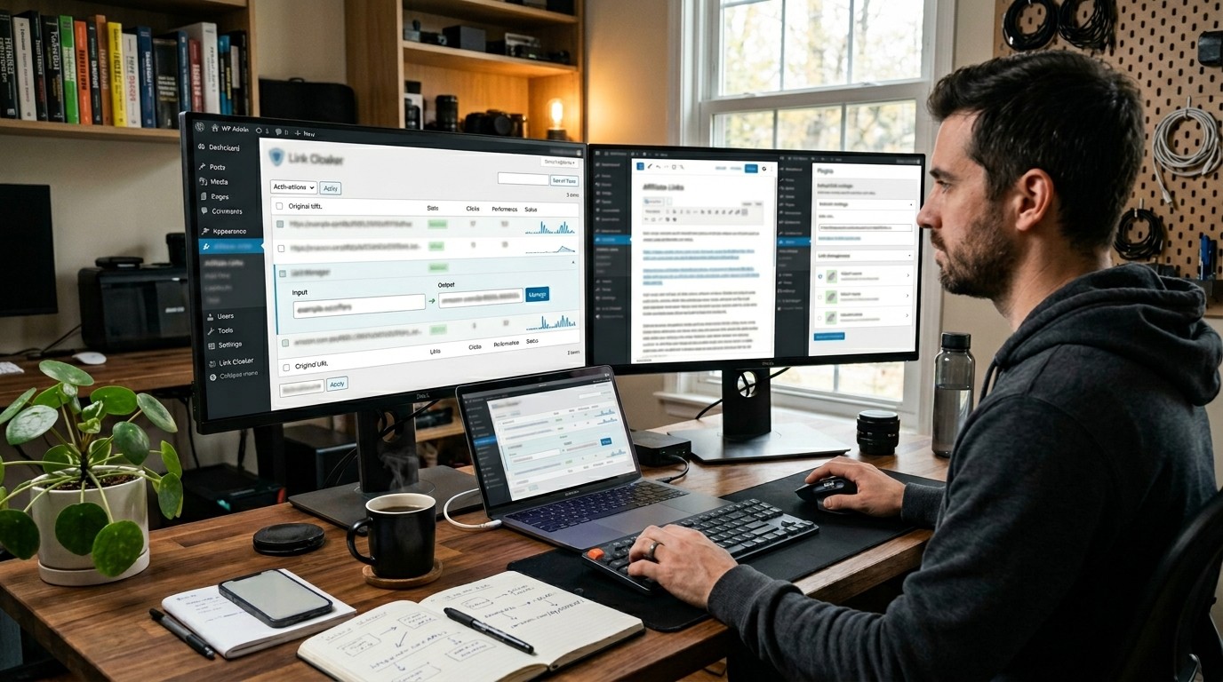
Many publishers compare Affiliate Link Cloaker with other plugins that promise automation, cloaking, reporting, or management tools. The real comparison, however, often comes down to usability. A feature-rich plugin that feels confusing may be less useful than a simpler one that is easy to run every day.
That is why Affiliate Link Cloaker should be judged both by capability and by ease of use. In a real publishing environment, usability is not optional. It is a major part of value.
How Better UI Supports Conversions
A better interface does not guarantee sales, but it can support them. Affiliate Link Cloaker can help create cleaner, more persuasive link presentation, which may increase the chance that a reader takes the next step. When the path looks organized, people are more likely to trust the recommendation.
Conversion support begins with user confidence. If the editor feels confident using Affiliate Link Cloaker, the final content often feels more coherent. That coherence can improve how readers respond to the page.
Naming and Terminology
Clear terminology matters more than many teams realize. Affiliate Link Cloaker should avoid jargon wherever possible. Labels need to be understandable for marketers, bloggers, editors, and business owners who may not think in technical terms.
When the interface uses plain language, users need less time to learn it. Affiliate Link Cloaker becomes more approachable because the screen communicates meaning directly. That is a core principle of good product design.
Table of Design Principles
| Design Principle | Effect on User |
|---|---|
| Simplicity | Less confusion |
| Consistency | More confidence |
| Visibility | Faster decision-making |
| Feedback | Better error handling |
| Organization | Easier maintenance |
Affiliate Link Cloaker should reflect these principles in every major screen. The goal is not decoration. The goal is clarity that supports action.
Why Long-Term Usability Matters
Many users do not abandon a plugin because it is impossible to learn. They abandon it because it becomes annoying over time. Affiliate Link Cloaker should avoid that problem by staying predictable as the site evolves.
Long-term usability depends on trust in the interface. When people know where everything is, they waste less energy reorienting themselves. Affiliate Link Cloaker becomes valuable when it remains dependable after the novelty has worn off.
How It Helps Small and Growing Sites
Small sites need simplicity. Growing sites need structure. Affiliate Link Cloaker can serve both when it keeps the core actions visible and the advanced features easy to discover. That flexibility is one reason link-management plugins stay relevant.
A small creator may only need a few link groups and quick edits. A larger team may need permissions, filters, and volume control. Affiliate Link Cloaker works best when it can stretch without becoming difficult.
Strategic Use in Content Operations
Affiliate operations are not only about inserting links. They involve planning, organization, updates, and quality control. Affiliate Link Cloaker becomes part of that strategy when it helps manage the full lifecycle of links from creation to refresh.
That broader role is important because content is rarely static. Posts get updated, offers change, and destinations move. Affiliate Link Cloaker should help the publisher respond to those changes cleanly and quickly.
What Great UI Feels Like
| Experience | What the User Feels |
|---|---|
| Fast setup | Relief |
| Clear labels | Confidence |
| Easy editing | Control |
| Organized links | Calm |
| Safe updates | Security |
Affiliate Link Cloaker should aim for this feeling profile. Good software is often remembered by how little stress it creates.
Natural Keyword Integration
When writing about Affiliate Link Cloaker, the best approach is to keep the discussion useful and human. That means focusing on practical benefits rather than forcing keywords into every sentence. Search engines understand context better when the text feels natural.
This article also connects with broader digital planning concepts such as GPL Global Presence, GPL Meaning In Business, and 7 Best WordPress Plugins, because creators often compare tools, branding, and site structure in one research session.
Content Psychology for Affiliate Publishers
Publishing is emotional as well as technical. Affiliate Link Cloaker helps reduce the sense of risk that often surrounds affiliate content by making the process feel cleaner. That emotional benefit matters because people work better when they feel in control.
A plugin that supports calm decision-making can improve consistency. Affiliate Link Cloaker helps create that calm by separating the essential controls from the noise. The result is a smoother production rhythm.
Final Recommendations for Site Owners
If a site owner wants faster publishing, better organization, and a more professional look, Affiliate Link Cloaker is the kind of tool worth evaluating carefully. The most important question is not whether it has every imaginable feature. The question is whether it makes daily work easier.
A good plugin should feel like part of the site’s operating system. Affiliate Link Cloaker achieves that when it saves time, reduces errors, and keeps the interface easy to understand.
Practical UI Patterns That Work
A plugin interface succeeds when it uses familiar patterns. A left-side navigation menu, a central workspace, and a clean settings area help users orient themselves quickly. The more predictable the structure is, the less time people spend searching and the more time they spend publishing. Strong design does not try to surprise users in the middle of a routine task. It gives them a steady path.
Buttons should also behave in a consistent way. Primary actions need to stand out, secondary actions need to stay available without competing for attention, and destructive actions should be visually separated from routine edits. That sort of visual discipline lowers the chance of mistakes. It also helps users understand which task matters most at each step.
Another useful pattern is progressive disclosure. Not every setting needs to appear on the first screen. When advanced controls stay available but out of the way, beginners feel less overwhelmed and experienced users still get the flexibility they need. This balance is often the difference between a plugin that feels friendly and one that feels crowded.
Common Mistakes to Avoid
One of the biggest mistakes in plugin design is placing too many controls in the same visual area. When every option looks equally important, nothing feels important. Users then spend more time interpreting the page than completing the task. A cleaner layout always performs better than a cluttered one.
Another mistake is inconsistent terminology. If one screen says redirect and another says destination without explanation, users have to pause and think. That pause may seem minor, but repeated confusion slows adoption. The same problem appears when icons are used without labels and the meaning is not obvious.
A third mistake is hiding feedback. Users should always know whether an action worked. If a link was saved, updated, or removed, the interface should confirm it clearly. Silence makes people repeat steps unnecessarily, which creates risk and frustration.
Strong UI Versus Weak UI
| Strong UI Trait | Weak UI Trait |
|---|---|
| Clear hierarchy | Crowded layout |
| Predictable labels | Confusing labels |
| Fast feedback | Unclear status |
| Simple navigation | Too many clicks |
| Calm spacing | Visual overload |
| Easy updates | Risky editing |
The comparison shows why polish matters. A plugin can have the same functional features as another tool and still feel completely different in daily use. A better interface reduces friction, and reduced friction improves consistency.
The Business Value Behind Good Design
Good UI does not exist only for aesthetic reasons. It supports business outcomes. When creators save time, they can publish more efficiently. When they trust the workflow, they make fewer avoidable mistakes. When the final links look clean, the content experience feels more professional. Those small gains accumulate across many posts and campaigns.
This is also why teams often become loyal to tools that feel dependable. They do not want to rethink their process every week. They want software that stays clear as their site grows. Reliable design creates that feeling. It reduces the hidden cost of switching, training, and rework.
The best products quietly strengthen operations in the background. They do their job without demanding attention. Over time, that quiet usefulness becomes one of the strongest forms of product value.
Editorial Strategy for Better Conversion Content

Affiliate content performs best when it is structured around the reader’s intent. The article should answer the main question first, then support it with clear explanation, proof, and context. A plugin that helps manage links cleanly should also encourage content that reads cleanly. The two layers work together.
Editors should think about placement, relevance, and rhythm. A link placed too early can feel interruptive. A link placed too late may miss the moment of interest. Good publishing tools support better timing by keeping the workflow organized. That improves the editor’s ability to create content that feels natural.
It also helps to keep the page visually balanced. Long blocks of text can wear readers down, while shorter sections and informative tables help the eye move. This is one reason structured, readable content tends to perform better than dense, unbroken prose.
What Readers Appreciate Most
| Reader Need | Best Response |
|---|---|
| Clarity | Simple explanation |
| Trust | Clean presentation |
| Speed | Easy navigation |
| Relevance | Accurate placement |
| Comfort | Low-friction design |
A plugin that supports these expectations can improve the whole publishing experience. The stronger the interface, the easier it becomes to keep the content aligned with user needs.
Final Perspective on Plugin Selection
Choosing a plugin should never be based on one screenshot alone. A truly useful tool proves itself over time. It should be evaluated by how it feels after the third, tenth, and fiftieth use, not just the first click. That is where consistent design matters most.
The best choice is usually the one that supports daily work without creating new chores. When the interface is calm, the workflow is faster. When the workflow is faster, the team can spend more energy on content quality. That chain of improvement is what turns a basic tool into a reliable part of the publishing stack.
Conclusion
A strong plugin interface is not a cosmetic luxury. It is part of the publishing system itself. When the controls are clear, the layout is stable, and the user can act without hesitation, the entire workflow becomes easier to sustain. That matters for affiliate publishers because their results depend on consistency over time. A cleaner interface reduces friction, helps prevent errors, and supports better content decisions. It also encourages teams to keep improving rather than avoiding the tool. In that sense, the right design is not only helpful; it is a quiet competitive advantage that compounds with every post, every update, and every campaign.
Frequently Asked Questions (FAQ)
1. What is the main purpose of this plugin style?
It helps publishers manage links in a cleaner, more organized way so the final website looks professional and easier to navigate.
2. Why does the interface matter so much?
The interface affects speed, confidence, and error prevention. A clearer dashboard makes the plugin easier to use and more likely to be adopted consistently.
3. Is a simple layout better than a complex one?
Usually yes. A simple layout reduces confusion, shortens the learning curve, and helps users focus on the actual publishing task.
4. Can it help with branding?
Yes. Clean link presentation can make a site feel more intentional, which supports trust and strengthens the overall brand experience.
5. Is this useful for small websites?
Yes. Small sites benefit from the simplicity, and larger sites benefit even more once the number of links grows.
6. What features should users look for?
Search, categories, quick edits, clear status labels, and helpful feedback messages are among the most valuable features in a well-designed tool.
7. How does good design reduce mistakes?
It makes actions obvious, shows warnings before risky changes, and confirms successful updates so users do not repeat tasks unnecessarily.
8. Why do publishers care about workflow speed?
Faster workflows free up time for writing, optimization, and campaign planning, which improves overall content production quality.
9. Does the user experience affect conversions?
Yes, indirectly. A cleaner link presentation can improve trust and reduce hesitation, which may encourage more clicks and better engagement.
10. What is the biggest lesson from this guide?
A plugin becomes truly valuable when it solves a real problem without creating new friction, confusion, or extra maintenance work.



Leave a Reply